Blue Cross Blue Shield
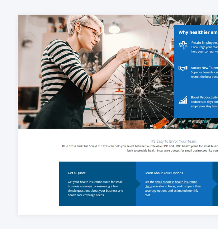
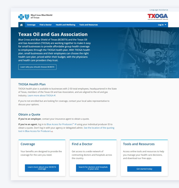
We crafted a beautiful design for Blue Cross Blue Shield that merges sleek, modern aesthetics with intuitive navigation, resulting in a seamless and user-friendly digital experience. Every element was purpose-built to guide users effortlessly while reinforcing trust, care, and clarity through smart layout decisions and a calming visual palette.

Sleek modern aesthetics
The design showcases a clean and elegant visual style that reflects professionalism and trust.
-
clean
-
elegant
-
professionalism
User-friendly experience
We prioritized accessibility and clarity to ensure a smooth and pleasant journey for every user.
-
accessibility
-
clarity
-
pleasant
Intuitive navigation
Navigation was streamlined to help users find what they need quickly and with minimal effort.
-
streamlined
-
find
-
effortless
Digital Wellness Starts Here
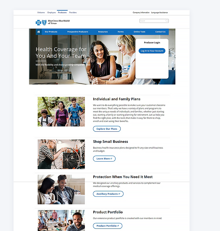
UX Design: Blue Cross Blue Shield
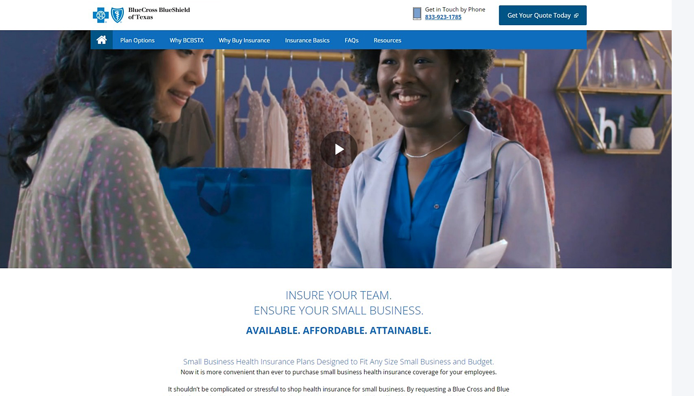
The design blends sleek aesthetics with a professional tone.
We employed a crisp, modern visual language that uses whitespace, typography, and color to evoke professionalism and calm - ideal for a healthcare brand. The interface feels clean yet personal, helping Blue Cross Blue Shield users feel confident, informed, and supported at every digital touchpoint.
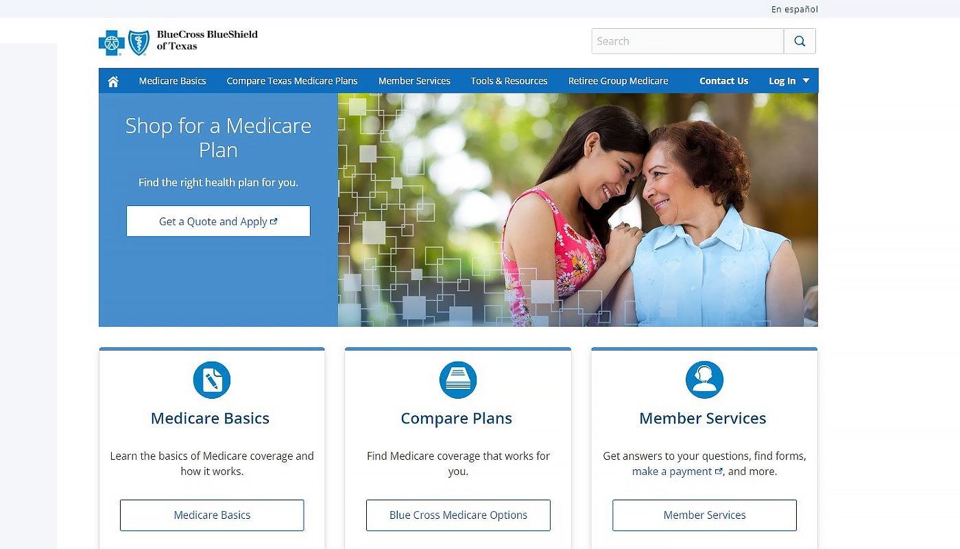
UX Design: Blue Cross Blue Shield
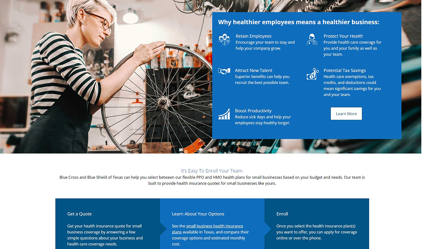
Navigation was designed for ease, clarity, and speed.
Rather than overload the user, we implemented a clear navigation structure with logical hierarchy, sticky headers, and clean dropdowns. Whether a first-time visitor or a returning member, the journey is seamless, allowing users to find critical information - fast and without frustration.
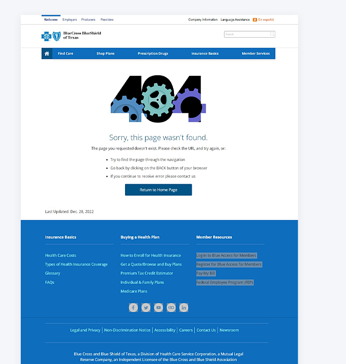
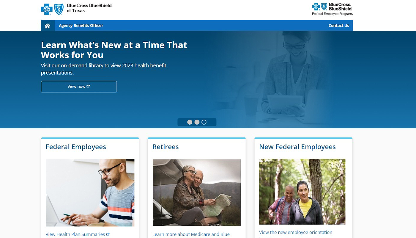
Want a site that not only looks amazing but actually works for your users? We don’t do cookie-cutter - we design with purpose, style, and a UX-first mindset that builds trust and converts. Whether you're in healthcare or any industry that demands clarity and confidence, let’s craft something bold together.
Request a quote below - your brand deserves better.