A2 Hosting

Clean user-focused interface
The interface uses smart spacing, clear hierarchy, and minimalist design to prioritize ease of use.
-
smart spacing
-
hierarchy
-
minimalist
Accessible performance metrics
Performance data is displayed clearly, with visual tools that make complex insights easy to digest.
-
data
-
visual
-
insights
Clear service and feature breakdown
We organized content to deliver a straightforward overview of services and features, making exploration frictionless.
-
overview
-
services
-
exploration
XXX
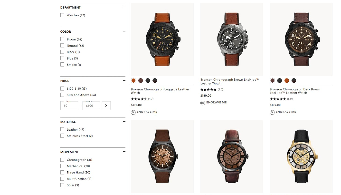
We developed a clean and intuitive interface that prioritizes usability.
The interface is deliberately minimal, using whitespace and visual hierarchy to draw attention to key information. Users are never lost or overwhelmed - everything is right where they expect it, from navigation to callouts, making exploration feel effortless and rewarding.
We made service details and performance metrics simple to access and understand.
Through carefully structured content blocks, icon-enhanced lists, and visual data elements like charts and graphs, we delivered a layout that educates while it impresses. Users can quickly grasp the value of every offering, with no need to dig through dense paragraphs or confusing tech-speak.

If you're done with cluttered websites that confuse more than they convert, it's time for a fresh approach. We create sleek, strategic interfaces that highlight your services, showcase performance, and let your value speak for itself - without saying too much. Ready to turn clarity into clicks?
Request a quote below and let’s make your message unmistakably clear.